

Brand guidelines
Brand and logo
Our logo, the flame and the social icons as SVG and PNG, together with the colour values and a few rules so the brand looks the same everywhere.
The logo
Our primary logo is the NB monogram with the flame inside the B. There are exactly two versions: our violet and white. Use white on coloured and dark surfaces, violet on light ones.
Social icons
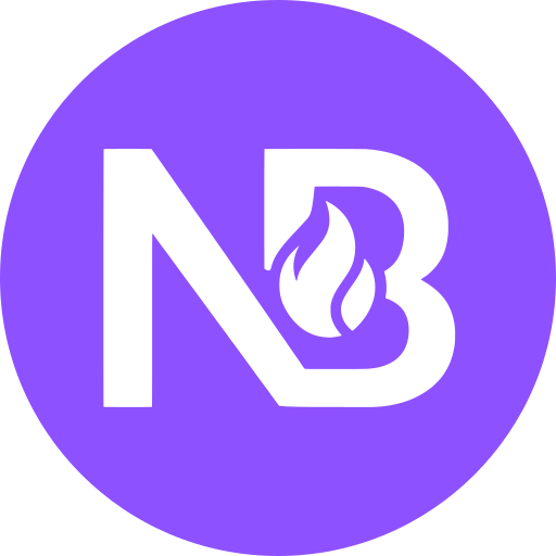
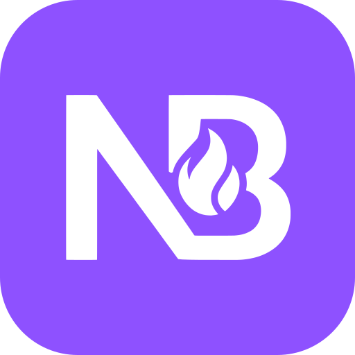
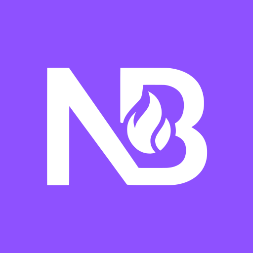
For profile pictures and icon rows there is the monogram on a violet tile, round, square or with rounded corners. Pick whichever shape suits the platform.
The logo
The flame
The flame on its own is our secondary mark. We use it where the full monogram does not fit, for instance as the loading indicator in the app. It is not meant as a replacement for the logo.



Colours
Two colours, nothing more is needed. The violet is the brand, white is its counterpart on dark ground. Click a field and the value lands on your clipboard.
Logo, surfaces, highlights
Violet text on white and buttons carrying white labels
Accents and focus rings on dark ground
How to write it
NaughtyBounty is one word, with a capital N and a capital B, no space and no hyphen. Not Naughty Bounty, not naughtybounty, not NAUGHTYBOUNTY.
NaughtyBounty
- Naughty Bounty
- naughtybounty
- NAUGHTYBOUNTY
Rules
Please do
- Leave enough clear space around it, at least the height of the N.
- Only use the files provided here.
- Use the white version on coloured backgrounds.
Please do not
- Stretch, rotate or crop the logo.
- Add your own colours, gradients, shadows or outlines.
- Combine the logo with other elements into a new mark.
Ready when you are.
Want content that actually fits you, or want to earn creating it? This is where users and models meet: private, protected, and fair for both sides.